Want to upgrade your Android experience? Try upgrading your launcher.
The best launchers
- Best overall Smart Launcher 5
- Long-term Legacy Nova Launcher
- Swiss Army Launcher Action Launcher
- Best Productivity Microsoft Launcher
- Pixel Perfected Lawnchair 2
- Quick and Simple Niagara Launcher
The way we arrange, organize, and interact with our apps on Android is called the launcher. Launchers usually consist of a series of home screens, where we can arrange app shortcuts and widgets and an app drawer. Every phone comes with a launcher, but when they drop the ball, there are endless third-party launchers that not only pick it up again but knock it clear out of the park. Everyone has their perfect launcher, but if you haven't found your favorite yet, then here are a few launchers we think will satisfy users of every type.
Best Overall: Smart Launcher 5
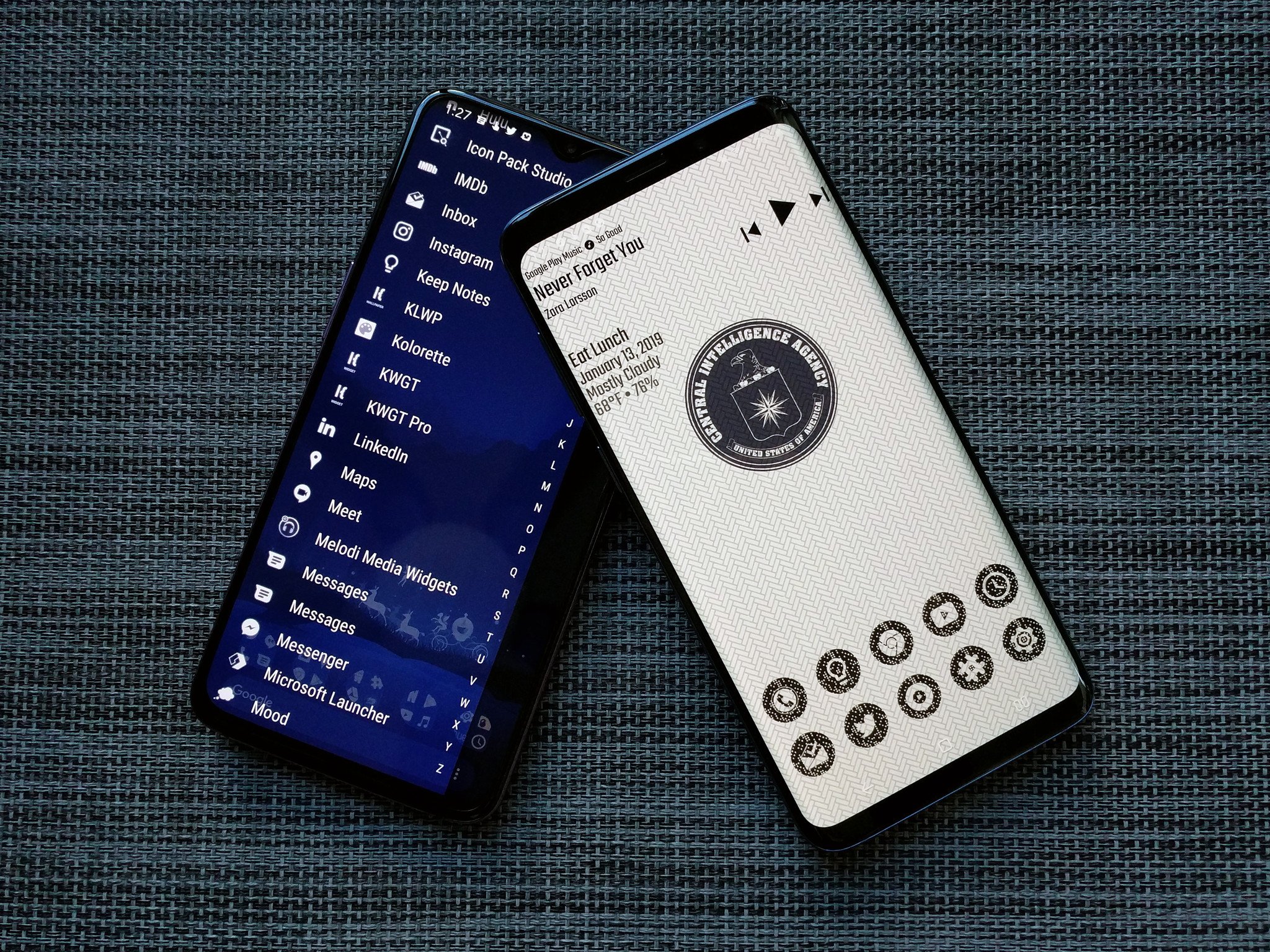
Smart Launcher has been around for years and years, but it really kicked things up a notch with Smart Launcher 5. The home screen features a grid-less widget placement system and modular page system, but the real star of the show here is still the app drawer. Smart Launcher 5 automatically sorts your apps into several categories, and if you pay for Smart Launcher Pro, you can add your own custom categories and sort your various drawer tabs in a variety of ways, from most-used to install time to icon color.
From a responsive and comprehensive categorical app drawer to some of the most precise widget placement on Android to the most diverse icon options on the market, Smart Launcher 5 has a lot to love. Its gestures are top-notch, too, especially the double-tap shortcuts for dock apps, which work worlds better than the swipe app shortcuts Nova and Action use.
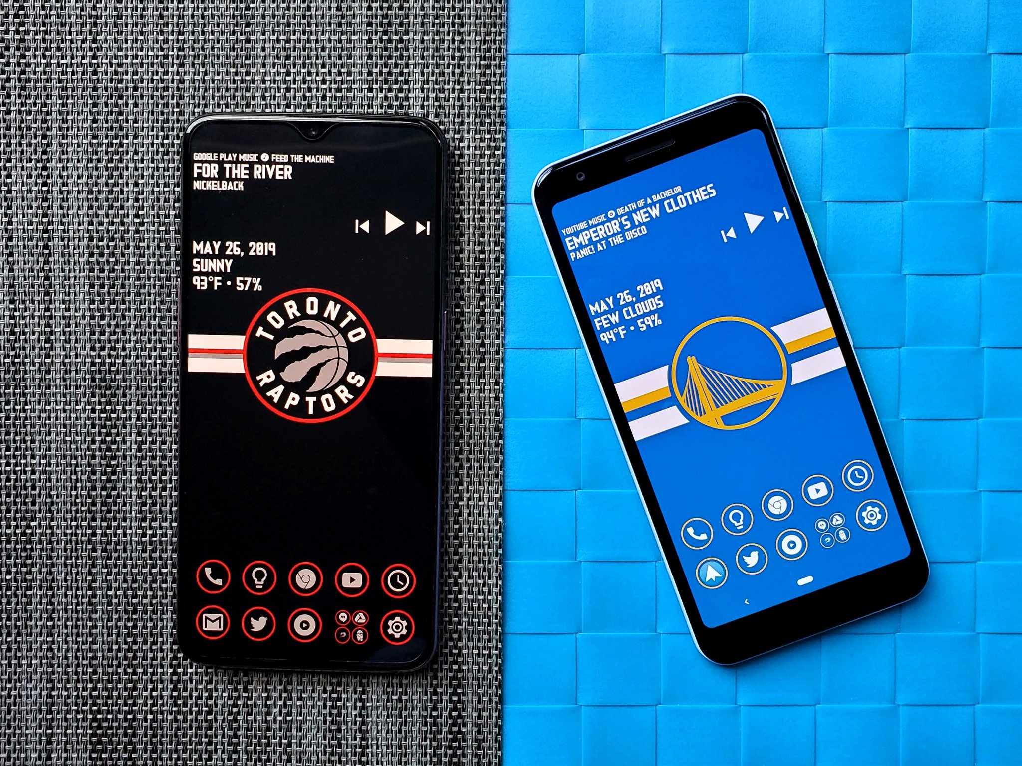
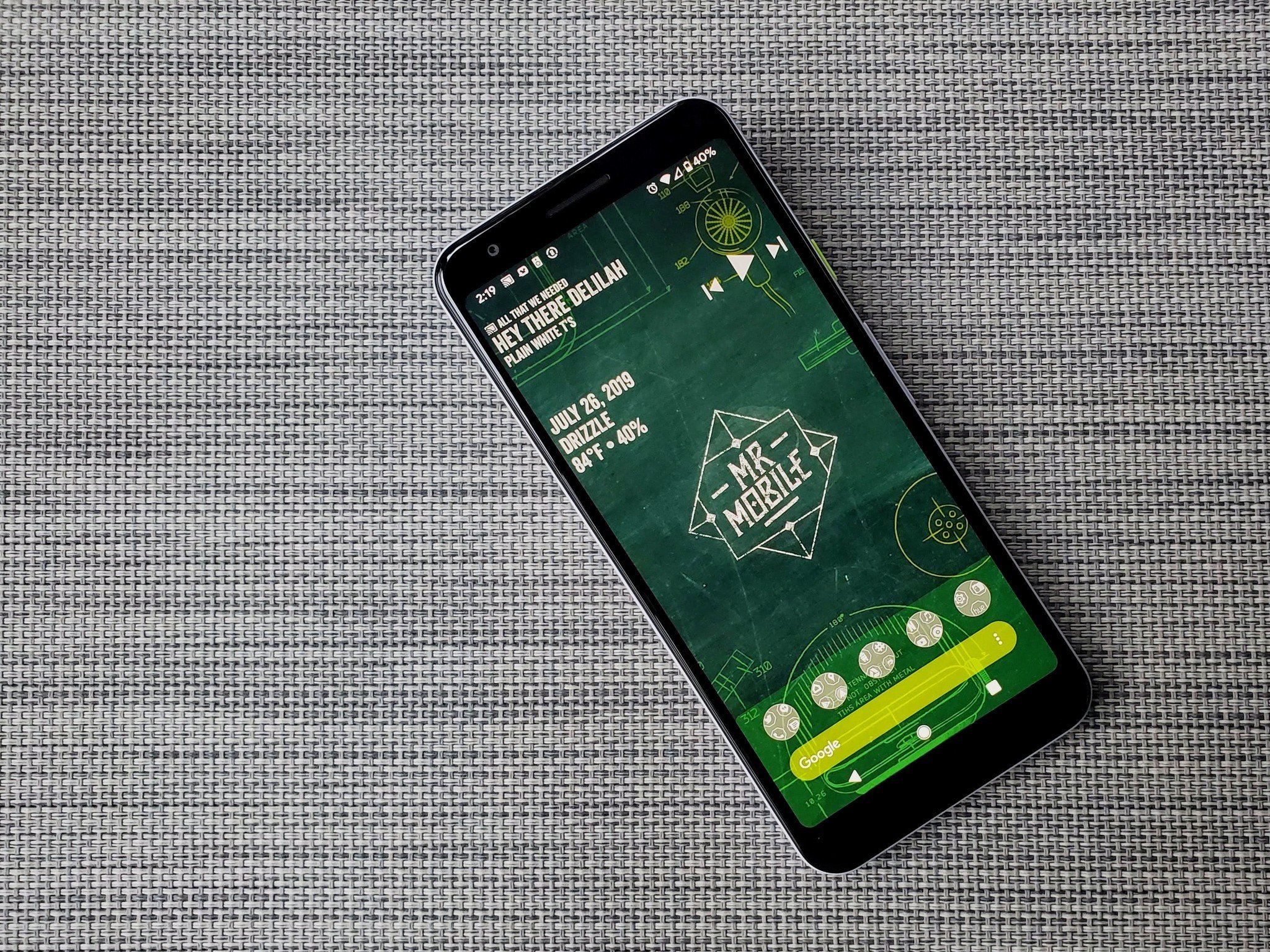
Smart Launcher is also part of the holy trinity of quick home screen theming I've used for the last two years, and it's been used in our dead awesome Deadpool theme, 2019 NBA Finals themes, revamped MrMobile theme, and more themes coming soon.
Pros:
- Easy setup with simplified layout
- Tabbed app drawer is wonderful
- Quickest launcher to theme
- Best home screen app gestures
Cons:
- You can't place icons at the top of the home screen
- Premium system can be confusing
Best Overall
Smart Launcher 5
Simple setup and wonderful widget pages
With a smart, widely adaptable app drawer, insane icon options through Icon Pack Studio, and a drop-dead simple home screen, Smart Launcher 5 has won my heart and my home screen.
Long-term Legacy: Nova Launcher
Nova Launcher has been a major player in the home screen market longer than most of us have even used Android. The reason for this continued dominance is simple. Nova's mix of customization, convenience, and cunning is unparalleled. Nova lets your phone look more Pixel-y than a Pixel and more TouchWiz-zy than a Galaxy and does it all with ease and grace. It also lets you build a home screen that is unique, stable, and solid while being as plain or beautiful as you'd like.
In fact, Nova's biggest strengths are hidden in plain sight, like its pocket ace Subgrid Positioning and its excellent backup system. The revamped Nova Settings are far easier to look through for features you might not know about than they were a year ago, and the launcher just keeps getting better and better.
For users just getting used to third-party launchers, the "import from other launchers" feature is the most consistent and reliable on Nova than just about every other launcher I've tried in previous years. If you want to ease yourself from the basic launcher to a custom experience, Nova can help you get comfortable with launcher layouts and themes.
Pros:
- Easy to import previous launcher layout
- Tons of customization options
- Great support and stability
- Buy Prime once and you're set for life
Cons:
- All the options can be overwhelming
- Theming can take a while
Long-term Legacy
Nova Launcher
Good ol' reliable launcher for the masses
Whether you want to build complex themes or you just want a smartly laid out launcher with excellent gesture controls, Nova is for you and your style.
Swiss Army Launcher: Action Launcher
The watchword of both Action Launcher and its users is quick — Quicktheme, Quickdrawer, Quickpage, Quickbar. To ensure it can be the quickest and best launcher for users who want to set everything up just so, Action Launcher has taken it upon itself to be one of the most customizable launchers on the market.
From its robust gesture controls to its ubiquitous Covers and Shutters to hide folders and widgets under app icons, Action Launcher makes it easy to get the home screen you want. If Quicktheme's color palette misses the mark, you can now set Material palette colors to get a more cohesive look! This was a long-awaited feature and it makes Action Launcher much more useful to live wallpaper users.
Action Launcher is also quick to support features from the newest versions of Android, or as much as can be replicated on a third-party launcher. Action Launcher's developer Chris Lacy is devoted, dedicated, and is quick to jump in on Android issues that impact third-party launchers, such as the issues with Android 10's gesture controls and third-party launchers. While the actual theme-building power here isn't quite as adaptable as Nova Launcher, it's a launcher that works incredibly, well, quick about getting you set up and on your way.
Pros:
- Customize almost everything
- Great gesture options
- Robust support
Cons:
- Not quite as flexible as Nova Launcher for theming
- Premium/Plus system can get confusing
Swiss Army Launcher
Action Launcher
Quick's the word and sharp's the gesture
Whether you want a launcher that's the peak of productivity or the height of sophistication, Action Launcher and its many quick features that can help you realize your dream setup.
Best Productivity: Microsoft Launcher
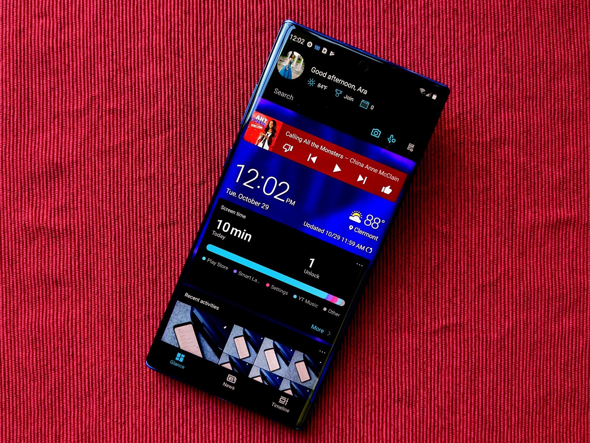
You'd think that if Microsoft was going to bring a launcher to Android, it'd match Windows 10 or maybe the old Windows Phone look — and you'd be wrong. Not only is Microsoft Launcher a completely Android-native experience, but it's a top-quality, ever-updating launcher. It's one of few outside Nova Launcher to offer edge-to-edge widgets and subgrid positioning.
Microsoft Launcher's experience centers around a clean home screen and a smart page to the left fed by your Microsoft account, your daily phone use, and any Android widgets you wish to add. Even if you're not immersed in the Microsoft ecosystem, having a scrolling page of widgets beats having to space them out over 3-4 pages. While this launcher's settings are somewhat clunky, it has all the launcher options you'd want and then some.
While Microsoft Launcher is definitely not as simplistic as Smart Launcher 5 or Niagara Launcher, it is still a fairly lightweight launcher that's well-worth considering, especially if you have any sort of reliance on Microsoft's ecosystem for work, school, or personal use.
Pros:
- Scrolling widget page
- Good enterprise integration
- Very active dev team
Cons:
- Settings need refinement
- Two-level dock is weird
Best Productivity
Microsoft Launcher
Integration and adaptability for the way you work
You can customize most aspects of this quite adaptable launcher, but it's also remarkably easy to have the launcher get out of your way and let you work.
Pixel Perfected: Lawnchair 2
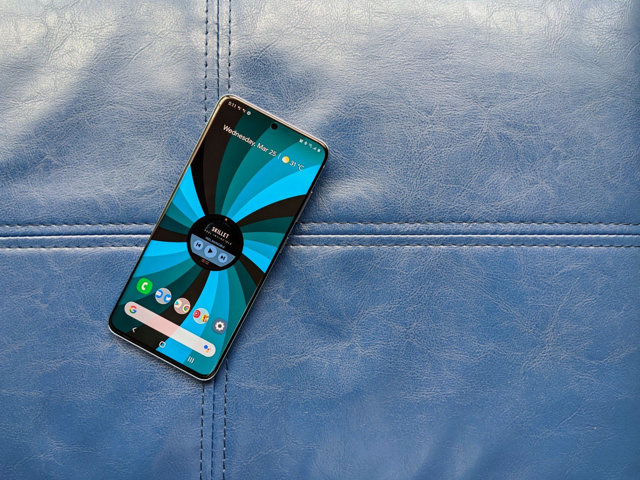
Everyone just absolutely adores the Pixel Launcher that Google develops and uses for Google Pixel phones, except that Pixel Launcher has no real options for the home screen, the dock, the app drawer, or really anything else. Lawnchair 2 is what we all actually wish the Pixel Launcher was: a full-bodied launcher with the clean Google look, but the ability to do all the things we expect a launcher to do in 2020: automatic theming, edge-to-edge widgets, adjustable icon and grid sizes, folder covers, and now even categorized app drawers.
Lawnchair has been around for a while, but the first version was left stagnant for months before Lawnchair 2 finally left beta towards the end of 2019. It was totally worth the wait, but just keep in mind that unless you're part of the testing community, don't expect updates to come as quickly as they do with Microsoft Launcher or Smart Launcher 5.
Pros:
- Easy, light customization
- Great community for support
- Open-source
Cons:
- Updates take a while
- Color picker & category settings could use work
- Can't import from other launchers
Pixel Perfected
Lawnchair 2
It's like Pixel Launcher but actually deserving of its hype
While it may take longer for Lawnchair to get updates, they're always worth the wait for the awesome open-source launcher that I wish shipped with AOSP.
Quick and Simple: Niagara Launcher
Niagara is still a shiny new launcher that's in the Early Access stage, but it's already got quite the following for being a lightning-fast launcher that's great for low-memory devices. It's also ridiculously simple to build themes around since it only has one layout. You can stick one or more widgets at the top, you have a quicklist of your favorite apps, and then you access the rest of your apps from the A-Z alphabet on the right side of the screen.
The feature set here is still pretty small — I'm really hoping that a double-tap to turn off the screen comes along soon — but if you just want to find your apps quickly and get on with your day, Niagara Launcher is a pretty great answer. It reminds me a bit of the old Z Launcher from a few years back, if you remember Nokia's experimental launcher, but I think this one is going to be around for a while.
Pros:
- Ridiculously fast
- Quick setup
- Drop dead easy interface
Cons:
- Very limited layout options
- Gestures can overlap at times
- Still in Early Access
Quick and Simple
Niagara Launcher
One layout, one super-fast app drawer.
While you may not be able to spread out all your apps and widgets on five different screens, this vertically scrolling launcher is lightning quick and works well on phones that more bloated launchers start to lag on.
Bottom line
My first launcher love was Nova, but Smart Launcher 5 won over my heart in 2018 and I haven't found anything else that works quite as well for my theme-loving setup. The categorical app drawer is better than one big A-Z sort once you have your categories set the way you want them, and the double-tap app shortcuts don't interfere with gesture navigation or swiping between the app drawer and home screen screens the way they do on Nova, Action, and just about every other launcher in existence.
If you want a launcher that's more like the launcher that came with your phone, Nova Launcher is the best bet because it imports from other launchers more consistently than any other launcher I've tried, allowing you to start with the setup you already had and then ease yourself into more advanced features like shortcut gestures and customizing the look of your folders, icons, and search bars.
Whichever of these launchers you opt for, the beauty of testing a launcher is that these all have a free tier that allows you to get a really good feel for the launcher and how it performs before you unlock extra features with Pro upgrades. If you have a launcher you absolutely adore, you should absolutely buy the pro key or contribute to the developers so that they can keep updating that launcher and keep it alive. Developers need to eat, too!
What happened to my gesture navigation?
This is not the launcher's fault. It's Google's.
If you're on an Android 10 phone that isn't a Google Pixel, using anything other than the default, manufacturer launcher on your phone will force you from the new Android 10 gesture nav back to ugly old three-button nav. This has been an issue since Android 10's initial launch, one that's made third-party launchers suffer for Google's incompetence.
This issue has since been fixed for the Google Pixel 4, but everyone else is still waiting for Google to add the fix to AOSP and let non-Pixel phones use whatever launcher they want with gesture navigation. And once again, shame on Google for ever allowing a major release of Android to ship like this.
What missed the cut
There are hundreds and hundreds of launchers out there, and while there are plenty of good ones, they can't all make the cut. Here are the launchers that couldn't make the cut:
- Evie Launcher is still a light, easy launcher, but it's not in active development anymore, which means that when bugs arise, there's no one to fix them. If you were/are using Evie, try either Smart Launcher 5, Niagara Launcher, or Pear Launcher if you're on a phone with limited RAM.
- Hyperion Launcher keeps making progress, but it's just too damn buggy to recommend over stable, customizable launchers like Nova and Action.
- BlackBerry Launcher hasn't seen any updates in a year and is just too expensive to recommend to anyone that isn't already an active BlackBerry Hub subscriber. If you're a business user, Microsoft Launcher is likely a better fit, and Microsoft Launcher's free.
from Android Central - Android Forums, News, Reviews, Help and Android Wallpapers https://ift.tt/2rkKsw7
via IFTTT




Aucun commentaire:
Enregistrer un commentaire